


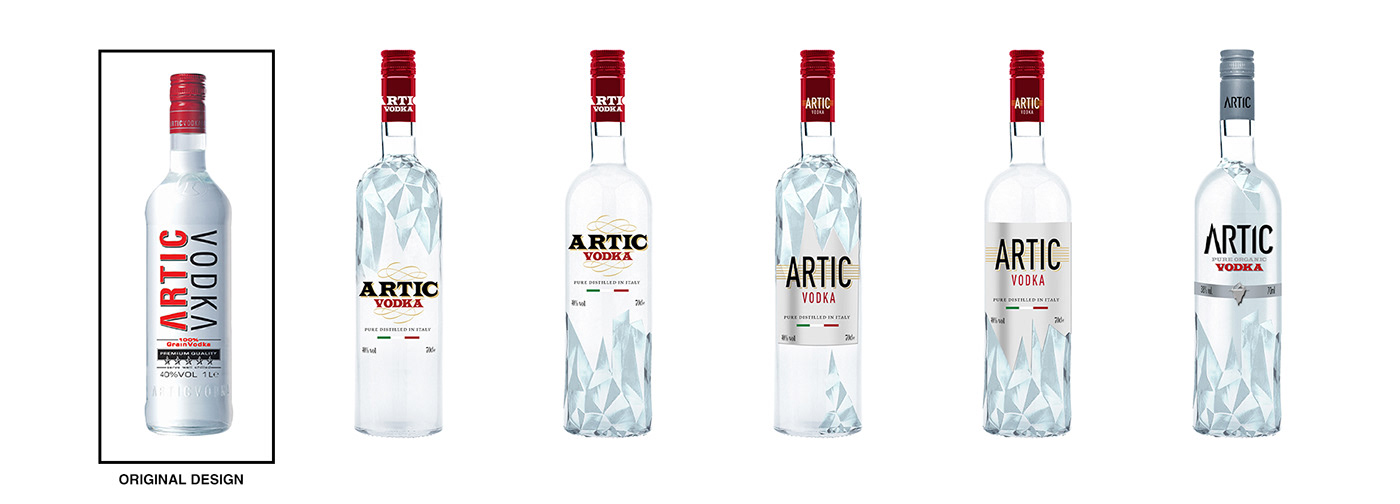
The last project I had the pleasure to work on as Design Manager at ILLVA Saronno was the restyling of Artic Vodka. The main reason of the restyling was to make the product more Premium and more eye-catching. The project was involving not only the label but also the glass of the bottle, and the new style had to have in mind the world of reference of the brand, the Arctic, and the value of the brand: the Italian craftsmanship. For the new silhouette of the bottle the company decided to follow the shape of one of the previews restyling I worked on (Rabarbaro Zucca), working on it to make it unique and memorable.
Here there are some first attempts. As you can see I immediately focused on explaining in a better way the world of reference and the brand name: Artic (an Italianization of the word Arctic). To resolve this problem I decided to create a new glass for the bottle inspired by the icy surface of the winter lakes. The idea was that the bottle was created by cutting it out from a piece of ice. Below you can see an inspirational video made to explain the new bottle in an early stage of the design.
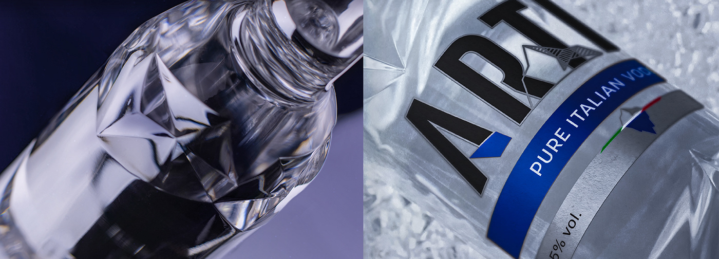
Also the branding has to be changed, according to the new positioning idea. The inspiration came from the world of reference: an iceberg. Initially I used both in the brand name, shaping the letter A like it, both for a little brand symbol to use in the middle of the label.

Many of these elements, present in the early stage works, where maintained till the end. Below you can find the final product. The main difference is the brand logo and colour. We decided to lose the red, the original colour of the brand, in favour of the blue, more coherent with the new positioning in the “icy” world.
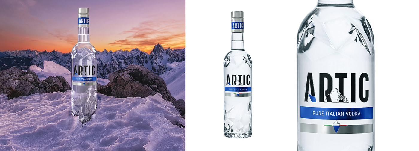
The new glass was a bit of a challenge. The brief was to create a bottle that was usable on the production line as the Zucca one. In this shape we had to fit the "ice cuts" making them recognisable, intriguing, premium and (last but not least) possible to make for the
Glassware. The final result is coherent with the marketing idea: a more premium, pure product, with a strong connection with Italy and the arctic (icy) world.
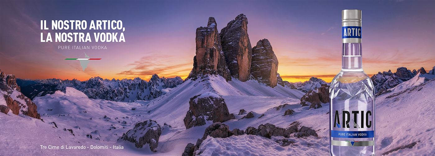
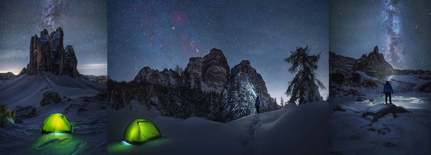
The new bottle needed a new positioning. For this reason more than a year apart, once I was already out of the company, ILLVA decided to contact me to work together on the Artic Campaign. The collaboration involved one of my new occupation: landscape photography. The idea of the Company was to explain the idea behind the restyling and the brand name, making a calendar showing the Italian Arctic.
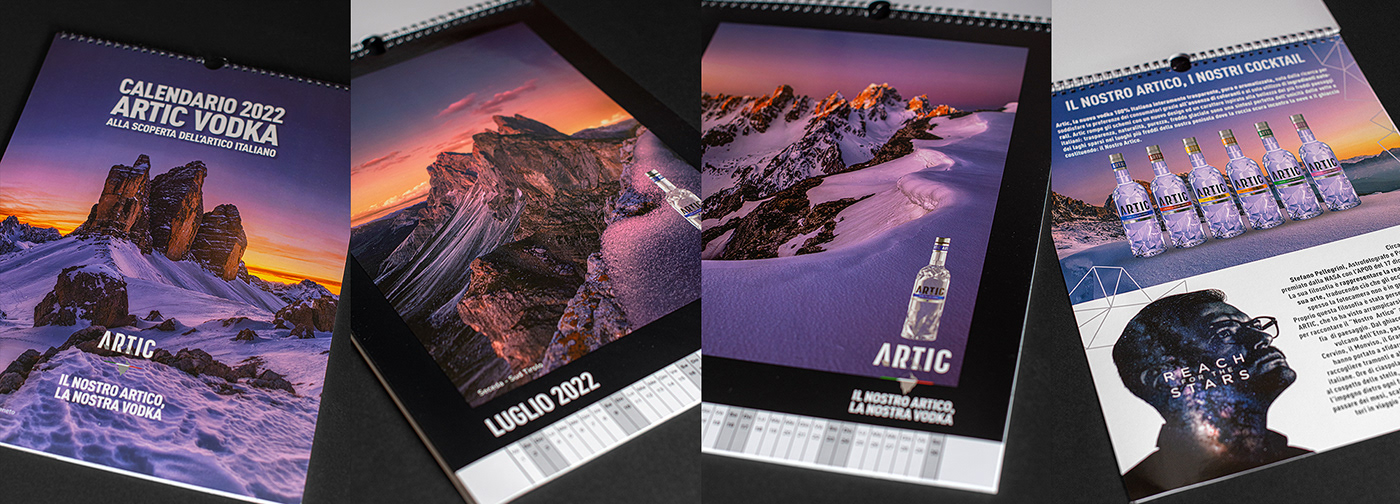
For this reason I spent more than 4 months, going around Italy, to capture sunsets and sunrise on the top of the most iconic italian mountains. From North to South, I made twelve “mission”, making hours of hikings in deep snow, and camping at high altitude in tent under the stars.
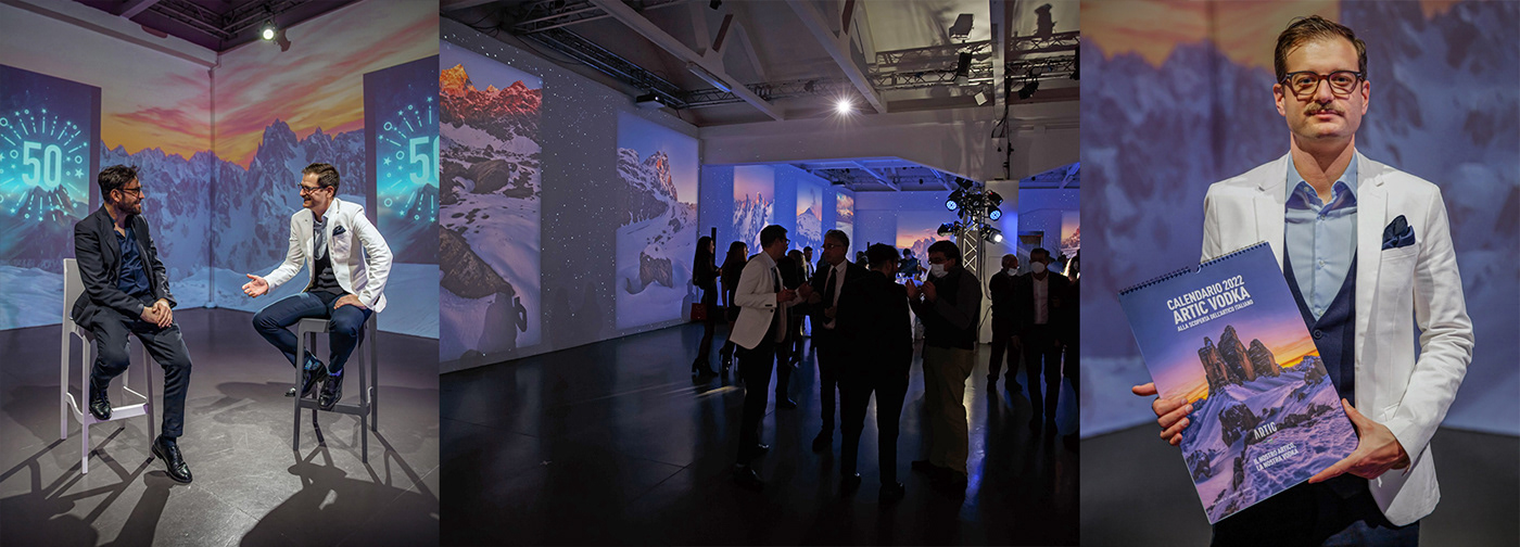
All the landscape photography work was unveild in the event for the launch of the new bottle. The peak of the event was my speech with the ILLVA Marketing manager. We talked about innovation and Italian craftsmanship, and of course about mountains and photography.
See more of my works at my website: pels.it


